AxeDB: Guitar Pricing Intelligence
New project for studying the used and vintage guitar markets
August 05, 2018
The 2018 MLB season has so far been just like every other season: filled with ups, downs, win streaks, teams plagued with injuries, and so-on. In this post I aim to catch up on the current season with a single chart, showing how the leagues’ rankings have changed throughout the year. My visualization of choice here is the bump chart, a type of line chart showing changes in rankings over time. If you just want to see the final product, this is what it looks like:
If you’re still reading, here’s how you can create your own.
First we’ll need data on every team’s record at each point within the season so far. My plan is to visualize this data in R with ggplot, and there are several capable R packages for pulling baseball data (baseballr and Lahman, to name two). Since I maintain the pybaseball package, however, I’ll eat my own dogfood and start from there.
I use pybaseball.schedule_and_record(year, team_code) to fetch each team’s 2018 data. Once these data are concatenated together to create the whole season’s records-file, I clean the Date column to standardize dates across the dataframe, cut off dates that are in the future, and calculate each team’s win percentage at the end of each game day. I then export this csv so it can be used in R with ggplot.
import pandas as pd
from pybaseball import schedule_and_record

teams = ['BOS','NYY','TB','TOR','BAL','CLE','MIN','KC','CHW',
         'DET','HOU','LAA','SEA','TEX','OAK','WSN','MIA','ATL',
         'NYM','PHI','CHC','MIL','STL','PIT','CIN','LAD','ARI',
         'COL','SD','SF']

# collect every team's record for the 2018 season
records = []
for t in teams:
    s = schedule_and_record(2018, t)
    records.append(s)

#concatenate records together so the whole season is in one dataframe
df = pd.concat(records, axis = 0)

# standardize the date formats of double-header games
df.Date = df.Date.str.replace(' (1)','',regex=False)
df.Date = df.Date.str.replace(' (2)','',regex=False)

# turn this into a date format that Pandas will recognize
df.Date = pd.to_datetime(df.Date,format='%A, %b %d')
df.Date = df.Date.map(lambda x: x.replace(year=2018))

# cut out games that havent happened yet
df = df.loc[df.Date < '2018-08-05']

# extract win and loss values from "w-l" strings
df['W'] = df['W-L'].str.split('-').str[0].astype(int)
df['L'] = df['W-L'].str.split('-').str[1].astype(int)
df['win_pct'] = df['W'] / (df['W'] + df['L'])

df.to_csv('2018-records.csv')
Next the data get loaded into R. It is easiest to rank the teams when their win rate is known at every point in time, not only on game days. For this reason, my first task for preparing the data is to fill in these missing non-game-day dates with the win-percentage of each team’s most recent game day.
library(cowplot)
library(dplyr)
library(tidyr)

win_percentages = read.csv('2018-records.csv')
win_percentages = win_percentages[, c('Tm', 'Date', 'win_pct')]
win_percentages[is.na(win_percentages$win_pct), 'win_pct'] = 0

# create a dummy column to give dplyr left_join the effect of a cross join
dates = setNames(data.frame(unique(win_percentages$Date), dummy=1), c('Date', 'dummy'))
teams = setNames(data.frame(unique(win_percentages$Tm), dummy=1), c('Tm', 'dummy'))

# rejoin tables to have one row per day per team
df = left_join(dates, teams, by='dummy')
df = left_join(df, win_percentages, by=c('Tm','Date'))

# fill non-gameday win percentages with the previous-gameday's win percent
df = df %>% mutate(Date = as.Date(Date)) %>%
            complete(Date = seq.Date(min(Date), max(Date), by="day")) %>%
            group_by(Tm) %>% fill('win_pct')

# remove NAs generated by the all star break when no games were played
df = df[!is.na(df$Tm),]
Now that the data is formatted how we want it, we’ll need rank them by their records. Because the bump-chart will be messy with all teams involved, and also because rankings across leagues don’t have much real-world value, we’ll want to separate NL teams from AL teams first. To do this, create a list of one league’s teams and use a dplyr filter on it.
al_teams = c('BOS', 'NYY', 'BAL', 'TBR', 'TOR', 'CHW','CLE',
             'DET', 'KCR', 'MIN','HOU','LAA', 'OAK', 'SEA', 'TEX')
al = df %>% filter(Tm %in% al_teams)
nl = df %>% filter(!(Tm %in% al_teams))
Next, correct for double-header days by grouping on date-team combinations and taking only the last row of each group. This is the record ad the end of the team’s double-header. After this, ranking teams by their records is as simple as grouping by Date, sorting by win percentage, and ordering them from best to worst. Ties in this case will naively go to the team that comes first in the alphabet.
by_date = al %>% group_by(Date, Tm) %>% filter(row_number()==n()) %>% unique()
by_date <- by_date %>% group_by(Date) %>%
           arrange(Date, desc(win_pct), Tm) %>%
           mutate(Rank = rank(-win_pct, ties.method = "first"))
Now on to the fun part: graphing it. We can start by defining the colors that will be associated with each team’s line on the graph. Because team colors are well known to fans, this will help the plot’s interpretability. Conveniently, there’s a website built for this exact purpose: teamcolorcodes.com. I selected a hex code for one of each team’s colors and add them to a list like so:
team_colors = c(BOS = '#BD3039', NYY = '#003087', TBR = '#8FBCE6', KCR = '#BD9B60',
                CHW = '#27251F', BAL = '#DF4601', CLE = '#E31937', MIN = '#002B5C',
                DET = '#FA4616', HOU = '#EB6E1F', LAA = '#BA0021', SEA = '#005C5C',
                TEX = '#003278', OAK = '#003831', WSN = '#14225A', MIA = '#FF6600',
                ATL = '#13274F', NYM = '#002D72', PHI = '#E81828', CHC = '#0E3386',
                MIL = '#B6922E', STL = '#C41E3A', PIT = '#FDB827', CIN = '#C6011F',
                LAD = '#005A9C', ARI = '#A71930', COL = '#33006F', SDP = '#002D62',
                SFG = '#FD5A1E', TOR = '#134A8E')
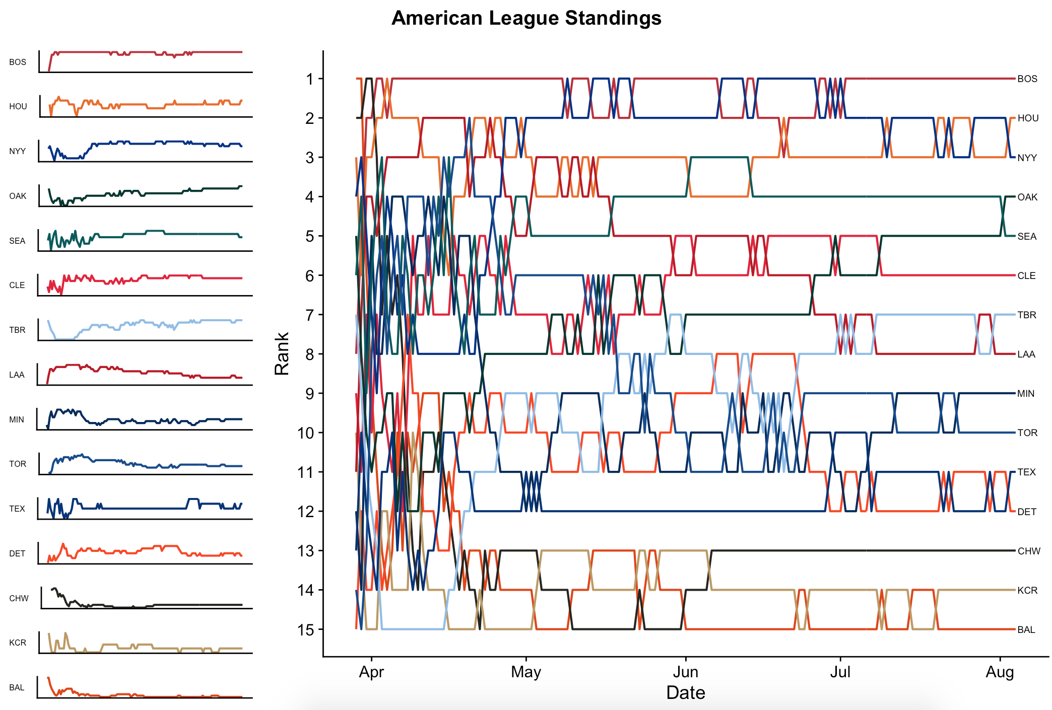
First let’s create the main plot: a bump chart showing the 15 teams’ rankings throughout the progression of the season. I plot a geom_line for each value of Tm, and then flip the scale so that a lower (better) value of Rank will be at the top of the Y axis. To make this somewhat interpretable, I label the teams at their final positions (yesterday, the most recent date for which I have data) at the tail-end of the chart, so that they can be traced back in time throughout the season, and color-code them with scale_color_manual so that each line matches the team’s colors. The code for the main chart is this:
p = ggplot(data = by_date, aes(x = Date, y = Rank, group = Tm)) +
    geom_line(aes(color = Tm), size = .75, show.legend=F) +
    scale_y_reverse(breaks = 1:32) +
    geom_text(data = subset(by_date, Date == as.Date("2018-08-04")),
              aes(label=Tm), size = 2.5, hjust = -.1) +
    scale_color_manual(values=team_colors)
Which produces an outcome that looks like this:
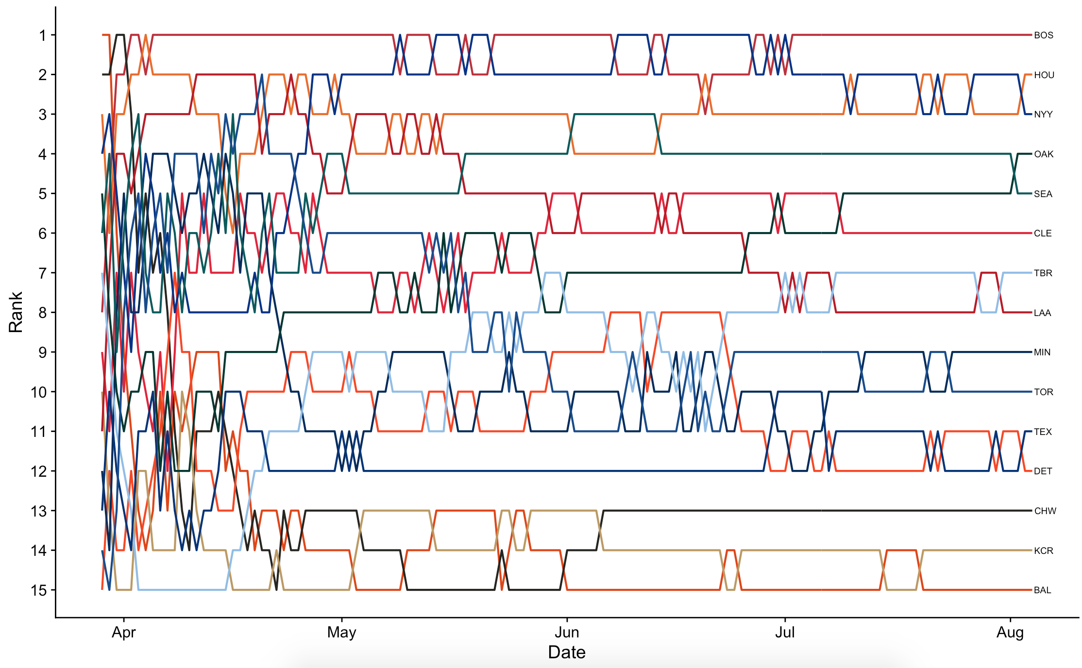
This is nice, but it’s also a bit noisy. As a visual aid, it will next be nice to show each team’s line in isolation along the border. To do this, we’ll first need a function for generating graph p for each team in isolation. This is the same as above, but with the axes wiped out to minimize noise.
teamplot = function(team_code){
    ggplot(data = by_date[by_date$Tm==team_code,], aes(x = Date, y = Rank, group = Tm)) +
    geom_line(aes(color = Tm), size = .75, show.legend=F) +
    scale_y_reverse(breaks = 1:32) +
    scale_color_manual(values=team_colors) +
    labs(y=team_code) +
    theme(axis.title.x = element_blank(),
          axis.text.x = element_blank(),
          axis.ticks.x = element_blank(),
          axis.ticks.y = element_blank(),
          axis.text.y = element_blank(),
          axis.title.y = element_text(angle=0, size=6))
}
With this in place, all that’s left is to arrange the team-charts and league-chart side by side. Luckily, there’s a library for that. Using library(grid), I define a 16x4 grid. Row 1 will be a title for the entire figure. Columns 2 - 4 will belong to the main chart showing all teams. Rows 2 - 16 in column 1, finally, will belong to the 15 individual-team charts. This is put together like so:
library(grid)
pushViewport(viewport(layout = grid.layout(nrow = 16, ncol = 4)))

# helper funciton for defining a region in the layout
# source: http://www.sthda.com/english/articles/24-ggpubr-publication-ready-plots/81-ggplot2-easy-way-to-mix-multiple-graphs-on-the-same-page/
define_region <- function(row, col){
  viewport(layout.pos.row = row, layout.pos.col = col)
}
grid.text(expression(bold("American League Standings")), vp = define_region(row =1:1, col = 1:4), gp=gpar(fontsize=15))
print(p, vp = define_region(row = 2:16, col = 2:4))
teams=unique(by_date[by_date$Date=='2018-08-04','Tm'])
for (idx in 2:16){
  print(teamplot(teams[[1]][[idx-1]]), vp = define_region(row = idx, col = 1))
}
which, finally, gives us a finished product that looks like this:
Replace al for nl in the code above to get the same figure for the National League, and then we’re done here. Simple enough!
New project for studying the used and vintage guitar markets
This post explores four algorithms for solving the multi-armed bandit problem (Epsilon Greedy, EXP3, Bayesian UCB, and UCB1), with implementations in Python ...
Multi-armed bandit algorithms are seeing renewed excitement, but evaluating their performance using a historic dataset is challenging. Here’s how I go about ...
An analysis of auction dynamics in client-side header bidding
Using machine learning to predict strategic infield positioning using statcast data and contextual feature engineering.
A quick tutorial on fetching MLB win-loss data with pybaseball and cleaning and visuzlizing it with the tidyverse (dplyr and ggplot).
Tanking becomes a hot topic each season once it becomes apparent which of the NBA’s worst teams will be missing the playoffs. In this post I address the valu...
I’ve been borderline obsessed with the eephus pitch for some time now. Every time I see a player pull this pitch out of their arsenal I become equal parts ex...
For the past three months I have had the exciting opportunity to intern as a data scientist at Major League Baseball Advanced Media, the technology arm of ML...
Throughout my baseball-facing work at MLB Advanced Media, I came to realize that there was no reliable Python tool available for sabermetric research and adv...
A collection of some of my favorite books. Business, popular economics, stats and machine learning, and some literature.
Each cup of coffee I have consumed in the past 5 months has been logged on a spreadsheet. Here’s what I’ve learned by data sciencing my coffee consumption.
Literature is a tricky area for data science. Think of your five favorite books. What do they have in common? Some may share an author or genre, but besides ...
Probabilistic modeling on NFL field goal data. Applying logistic regression, random forests, and neural networks in R to measure contributing factors of fiel...