In this post I discuss the multi-armed bandit problem and implementations of four specific bandit algorithms in Python (epsilon greedy, UCB1, a Bayesian UCB, and EXP3). I evaluate their performance as content recommendation systems on a real-world movie ratings dataset and provide simple, reproducible code for applying these algorithms to other tasks.
What’s a Bandit?
Multi-armed bandits belong to a class of online learning algorithms that allocate a fixed number of resources to a set of competing choices, attempting to learn an optimal resource allocation policy over time.
The multi-armed bandit problem is often introduced via an analogy of a gambler playing slot machines. Imagine you’re at a casino and are presented with a row of \(k\) slot machines, with each machine having a hidden payoff function that determines how much it will pay out. You enter the casino with a fixed amount of money and want to learn the best strategy to maximize your profits. Initially you have no information about which machine is expected to pay out the most money, so you try one at random and observe its payout. Now that you have a little more information than you had before, you need to decide: do I exploit this machine now that I know more about its payoff function, or do I explore the other options by pulling arms that I have less information about? You want to strike the most profitable balance between exploring all potential machines so that you don’t miss out on a valuable one by simply not trying it enough times, and exploiting the machine that has been most profitable so far. A multi-armed bandit algorithm is designed to learn an optimal balance for allocating resources between a fixed number of choices in a situation such as this one, maximizing cumulative rewards over time by learning an efficient explore vs. exploit policy.

Before looking at any specific algorithms, it’s useful to first establish a few definitions and core principles, since the language and problem setup of the bandit setting differs slightly from those of traditional machine learning. The bandit setting, in short, looks like this:
- You’re presented with \(k\) distinct “arms” to choose from. An arm can be a piece of content for a recommender system, a stock pick, a promotional offer, etc.
- Observe information about how these arms have performed in the past, such as how many times the arm has been pulled and what its payoff value was each time
- “Pull” the arm (choose the action) deemed best by the algorithm’s policy
- Observe its reward (how positive the outcome was) and/or its regret (how much worse this action was compared to how the best-possible action would have performed in hindsight)
- Use this reward and/or regret information to update the policy used to select arms in the future
- Continue this process over time, attempting to learn a policy that balances exploration and exploitation in order to minimize cumulative regret
This bears several similarities to reinforcement learning techniques such as Q-learning, which similarly learn and modify a policy over time. The time-dependence of a bandit problem (start with zero or minimal information about all arms, learn more over time) is a significant departure from the traditional machine learning problem setting, where the full dataset is available to a model at once, which can be trained as a one-off process. Bandits require repeated, incremental policy updates.
Dataset and Experiment Setup
There are several nuances to running a multi-armed bandit experiment using a real-world dataset. I describe the experiment setup in detail in this post. I encourage you to read through it before proceeding. If not, here’s the short version of how this experiment is set up:
- I use the Movielens dataset of 25m movie ratings
- The problem is re-cast from a 0-5 star rating problem to a binary like/no-like problem, with 4.5 stars and above representing a “liked” movie
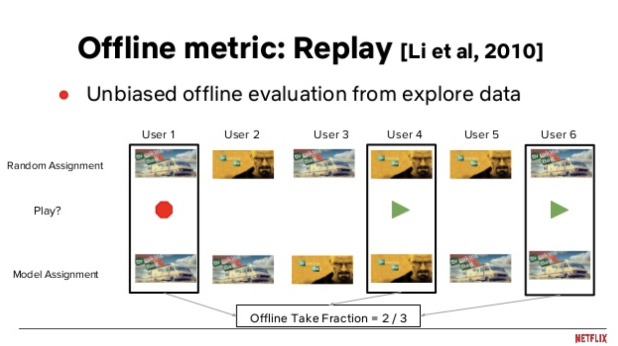
- I use a method called Replay to remove bias in the historic dataset and simulate how the bandit would perform in a live production environment
- I evaluate the algorithms’ performance using Replay and the percentage of the bandits’ recommendations that were “liked” to assess algorithm quality
- To speed up the time it takes to run these algorithms, I recommend slates of movies instead of one movie at a time, and I also serve recommendations to batches of users rather than updating the bandit’s policy once for each data point
But really, read the full version to better understand the ins and outs of evaluating a multi-armed bandit algorithm using a historic dataset.
Epsilon Greedy
The simplest bandits follow semi-uniform strategies. The most popular of these is called epsilon greedy.
Like the name suggests, the epsilon greedy algorithm follows a greedy arm selection policy, selecting the best-performing arm at each time step. However, \(\epsilon\) percent of the time, it will go off-policy and choose an arm at random. The value of \(\epsilon\) determines the fraction of the time when the algorithm explores available arms, and exploits the ones that have performed the best historically the rest of the time.
This algorithm has a few perks. First, it’s easy to explain (explore \(\epsilon \%\) of time steps, exploit \((1-\epsilon)\%\). The algorithm fits in a single sentence!). Second, \(\epsilon\) is straightforward to optimize. Third, despite its simplicity, it typically yields pretty good results. Epsilon greedy is the linear regression of bandit algorithms.
Much like linear regression can be extended to a broader family of generalized linear models, there are several adaptations of the epsilon greedy algorithm that trade off some of its simplicity for better performance. One such improvement is to use an epsilon-decreasing strategy. In this version of the algorithm, \(\epsilon\) decays over time. The intuition for this is that the need for exploration decreases over time, and selecting random arms becomes increasingly inefficient as the algorithm eventually has more complete information about the available arms. Another available take on this algorithm is an epsilon-first strategy, where the bandit acts completely random for a fixed amount of time to sample the available arms, and then purely exploits thereafter. I’m not going to use either of these approaches in this post, but it’s worth mentioning that these options are out there.
Implementing the traditional epsilon greedy bandit strategy in Python is straightforward:
def epsilon_greedy_policy(df, arms, epsilon=0.15, slate_size=5, batch_size=50):
    '''
    Applies Epsilon Greedy policy to generate movie recommendations.
    Args:
        df: dataframe. Dataset to apply the policy to
        arms: list or array. ID of every eligible arm.
        epsilon: float. represents the % of timesteps where we explore random arms
        slate_size: int. the number of recommendations to make at each step.
        batch_size: int. the number of users to serve these recommendations to before updating the bandit's policy.
    '''
    # draw a 0 or 1 from a binomial distribution, with epsilon% likelihood of drawing a 1
    explore = np.random.binomial(1, epsilon)
    # if explore: shuffle movies to choose a random set of recommendations
    if explore == 1 or df.shape[0]==0:
        recs = np.random.choice(arms, size=(slate_size), replace=False)
    # if exploit: sort movies by "like rate", recommend movies with the best performance so far
    else:
        scores = df[['movieId', 'liked']].groupby('movieId').agg({'liked': ['mean', 'count']})
        scores.columns = ['mean', 'count']
        scores['movieId'] = scores.index
        scores = scores.sort_values('mean', ascending=False)
        recs = scores.loc[scores.index[0:slate_size], 'movieId'].values
    return recs

# apply epsilon greedy policy to the historic dataset (all arm-pulls prior to the current step that passed the replay-filter)
recs = epsilon_greedy_policy(df=history.loc[history.t<=t,], arms=df.movieId.unique)

# get the score from this set of recommendations, add this to the bandit's history to influence its future decisions
history, action_score = score(history, df, t, batch_size, recs)
UCB1 (Upper Confidence Bound Algorithm)
Epsilon greedy performs pretty well, but it’s easy to see how selecting arms at random can be inefficient. If you have one movie that 50% of users have liked, and another at 5% have liked, epsilon greedy is equally likely to pick either of these movies when exploring random arms. Upper Confidence Bound algorithms were introduced as a class of bandit algorithm that explores more efficiently.
Upper Confidence Bound algorithms construct a confidence interval of what each arm’s true performance might be, factoring in the uncertainty caused by variance in the data and the fact that we’re only able to observe a limited sample of pulls for any given arm. The algorithms then optimistically assume that each arm will perform as well as its upper confidence bound (UCB), selecting the arm with the highest UCB.
This has a number of nice qualities. First, you can parameterize the size of the confidence interval to control how aggressively the bandit explores or exploits (e.g you can run a 99% confidence interval to explore heavily, or a 50% confidence interval to mostly exploit.) Second, using upper confidence bounds causes the bandit to explore more efficiently than an epsilon greedy bandit. This happens because confidence intervals shrink as you see additional data points for a given arm. So, while the algorithm will gravitate toward picking arms with high average performance, it will periodically give less-explored arms a chance since their confidence intervals are wider.
Seeing this visually helps to understand how these confidence bounds produce an efficient balance of exploration and exploitation. Below I’ve produced an imaginary scenario where a UCB bandit is determining which article to show at the top of a news website. There are three articles, judged according to the upper confidence bound of their click-through-rate (CTR).
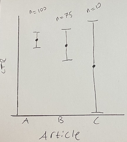
Artice A has been seen 100 times and has the best CTR. Article B has a slightly worse CTR than article A, but it hasn’t been seen by as many users, so there’s also more uncertainty about how well it’s going to perform in the long run. For this reason, it has a larger confidence bound, giving it a slightly higher UCB score than article A. Article C was published just moments ago, so almost no users have seen it. We’re extremely uncertain about how high its CTR will ultimately be, so its UCB is highest of all for now despite its initial CTR being low.
Over time, more users will see articles B and C, and their confidence bounds will become more narrow and look more like that of article A. As we learn more about B and C, we’ll shift from exploration toward exploitation as the articles’ confidence intervals collapse toward their means. Unless the CTR of article B or C improves, the bandit will quickly start to favor article A again as the other articles’ confidence bounds shrink.
A good UCB algorithm to start with is UCB1. UCB1 uses Hoeffding’s inequality to assign an upper bound to an arm’s mean reward where there’s high probability that the true mean will be below the UCB assigned by the algorithm. The inequality states that:
\[P(\mu_{a} > \hat{\mu}_{t,a} + U_{t}(a)) \leq e^{-2tU_{t}(a)^2},\]where \(\mu_{a}\) is arm \(a\)’s true mean reward, \(\hat{\mu}_{t,a}\) is \(a\)’s observed mean reward at time \(t\), and \(U_{t}(a)\) is an upper confidence bound value for arm \(a\) which, when added the mean reward, gives you an upper confidence bound. Setting \(p = e^{-2tU_{t}(a)^2}\) gives us the following value for the UCB term:
\[U_{t}(a) = \sqrt{\frac{-\log{p}}{2n_{a}}}.\]Note that in the denominator I’m replacing \(t\) with \(n_{a}\), since it represents the number of times arm \(a\) has been pulled, which will eventually differ from the total number of time steps \(t\) the algorithm has been running at a given point in time.
Setting the probability \(p\) of the true mean being greater than the UCB to be less than or equal to \(t^{-4}\), a small probability that quickly converges to zero as the number of rounds \(t\) grows, ultimately gives us the UCB1 algorithm, which pulls the arm that maximizes:
\[\bar{x}_{t,a}+ \sqrt{\frac{2\log(t)}{n_{a}}}.\]Here \(\bar{x}_{t,a}\) is the mean observed reward of arm \(a\) at time \(t\), \(t\) is the current time step in the algorithm, and \(n_{a}\) is the number of times arm \(a\) has been pulled so far.
Putting this all together, it means that a high “like” rate for a movie in this dataset will increase the likelihood of an arm being pulled, but so will a lower number of times the arm has been pulled so far, which encourages exploration. Also notice that the part of the function that includes the number of time steps the algorithm has been running (\(t\)) is inside a logarithm, which causes the algorithm’s propensity to explore to decay over time. Jeremy Kun’s blog has a very nice explanation of this algorithm and the proofs that support it. I also found this post from Lilian Weng’s blog helpful for understanding how the confidence bounds are created using Hoeffding’s inequality.
Here’s how the UCB1 policy looks in Python:
def ucb1_policy(df, t, ucb_scale=2.0):
    '''
    Applies UCB1 policy to generate movie recommendations
    Args:
        df: dataframe. Dataset to apply UCB policy to.
        ucb_scale: float. Most implementations use 2.0.
        t: int. represents the current time step.
    '''
    scores = df[['movieId', 'liked']].groupby('movieId').agg({'liked': ['mean', 'count', 'std']})
    scores.columns = ['mean', 'count', 'std']
    scores['ucb'] = scores['mean'] + np.sqrt(
            (
                (2 * np.log10(t)) /
                scores['count']
            )
        )
    scores['movieId'] = scores.index
    scores = scores.sort_values('ucb', ascending=False)
    recs = scores.loc[scores.index[0:args.n], 'movieId'].values
    return recs

recs = ucb1_policy(df=history.loc[history.t<=t,], t, ucb_scale=args.ucb_scale)
history, action_score = score(history, df, t, args.batch_size, recs)
From UCB1 to a Bayesian UCB
An extension of UCB1 that goes a step further is the Bayesian UCB algorithm. This bandit algorithm takes the same principles of UCB1, but lets you incorporate prior information about the distribution of an arm’s rewards to explore more efficiently (the Hoeffding inequality’s approach to generating a UCB1’s confidence bound makes no such assumptions).
Going from UCB1 to a Bayesian UCB can be fairly simple. If you assume the rewards of each arm are normally distributed, you can simply swap out the UCB term from UCB1 with \(\frac{c\sigma(x_{a})}{\sqrt{n_{a}}}\), where \(\sigma(x_{a})\) is the standard deviation of arm \(a\)’s rewards, \(c\) is an adjustable hyperparameter for determining the size of the confidence interval you’re adding to an arm’s mean observed reward, \(n_{a}\) is the number of times arm \(a\) has been pulled, and \(\bar{x}_{a} \pm \frac{c\sigma(x_{a})}{\sqrt{n_{a}}}\) is a confidence interval for arm \(a\) (so a 95% confidence interval can be represented with \(c=1.96\)). It’s common to see this outperform UCB1 in practice. You can see a little more detail about this in these slides from UCL’s reinforcement learning course.
Implementation-wise, turning the above UCB1 policy into a bayesian UCB policy is pretty simple. All you have to do is replace this logic from the UCB1 policy:
scores['ucb'] = scores['mean'] + np.sqrt(
        (
            (2 * np.log10(t)) /
            scores['count']
        )
    )
with this:
scores['ucb'] = scores['mean'] + (ucb_scale * scores['std'] / np.sqrt(scores['count']))
and there you have it! Your UCB bandit is now bayesian.
EXP3
A third popular bandit strategy is an algorithm called EXP3, short for Exponential-weight algorithm for Exploration and Exploitation. EXP3 feels a bit more like traditional machine learning algorithms than epsilon greedy or UCB1, because it learns weights for defining how promising each arm is over time. Similar to with UCB1, EXP3 attempts to be an efficient learner by placing more weight on good arms and less weight on ones that aren’t as promising.
The algorithm starts by initializing a vector of weights \(w\) with one weight per arm in the dataset and each weight initialized to equal 1. It also takes as input an exploration parameter \(\gamma\), which controls the algorithm’s likelihood to explore arms uniformly at random. Then, for each time step, we:
\[\begin{align} &1. \text{ Set } p_{i}(t) = (1-\gamma)\frac{w_{i}(t)}{\sum_{a=1}^{k} w_{a}(t)} + \frac{\gamma}{k} \\ &2. \text{ Draw the next arm } i_{t} \text{ randomly according to probabilities } p_{i}(t), ..., p_{k}(t) \\ &3. \text{ Observe reward } x_{i_{t}}(t) \in [0,1] \\ &4. \text{ Define the estimated reward } \hat{x}_{a_t}(t) \text{ to be: } \frac{x_{a_t}(t)}{p_{a_t}(t)} \text{ for } a=i_{t} \text{, 0 for all other } a. \\ &5. \text{ Set } \displaystyle w_{i_t}(t+1) = w_{i_t}(t) e^{\gamma \hat{x}_{i_t}(t) / K} \end{align}\]Here \(i_{t}\) represents a given arm at step \(t\), where there are \(k\) available arms to choose from and \(a\) is an index over all \(k\) arms used to denote summing over all weights in step (1) and assigning all non-selected arms a reward of zero in step (4).
In English, the algorithm exploits by drawing from a learned distribution of weights \(w\) which prioritize better-performing arms, but in a probabilistic way that still lets all arms be sampled from. The exploration parameter \(\gamma\) gives an additional nudge of favoritism to all arms, making worse-performing arms more likely to be sampled. Taken to its extreme, \(\gamma=1\) would cause the learned weights to be ignored entirely in favor of pure, random exploration.
In Python, the EXP3 recommendation policy looks like this:
import math
import pandas as pd
import numpy as np
from numpy.random import choice

def distr(weights, gamma=0.0):
    weight_sum = float(sum(weights))
    return tuple((1.0 - gamma) * (w / weight_sum) + (gamma / len(weights)) for w in weights)

def draw(probability_distribution, n_recs=1):
    arm = choice(df.movieId.unique(), size=n_recs,
        p=probability_distribution, replace=False)
    return arm

def update_weights(weights, gamma, movieId_weight_mapping, probability_distribution, actions):
    # iter through actions. up to n updates / rec
    if actions.shape[0] == 0:
        return weights
    for a in range(actions.shape[0]):
        action = actions[a:a+1]
        weight_idx = movieId_weight_mapping[action.movieId.values[0]]
        estimated_reward = 1.0 * action.liked.values[0] / probability_distribution[weight_idx]
        weights[weight_idx] *= math.exp(estimated_reward * gamma / num_arms)
    return weights

def exp3_policy(df, history, t, weights, movieId_weight_mapping, gamma, n_recs, batch_size):
    '''
    Applies EXP3 policy to generate movie recommendations
    Args:
        df: dataframe. Dataset to apply EXP3 policy to
        history: dataframe. events that the offline bandit has access to (not discarded by replay evaluation method)
        t: int. represents the current time step.
        weights: array or list. Weights used by EXP3 algorithm.
        movieId_weight_mapping: dict. Maping between movie IDs and their index in the array of EXP3 weights.
        gamma: float. hyperparameter for algorithm tuning.
        n_recs: int. Number of recommendations to generate in each iteration.
        batch_size: int. Number of observations to show recommendations to in each iteration.
    '''
    probability_distribution = distr(weights, gamma)
    recs = draw(probability_distribution, n_recs=n_recs)
    history, action_score = score(history, df, t, batch_size, recs)
    weights = update_weights(weights, gamma, movieId_weight_mapping, probability_distribution, action_score)
    action_score = action_score.liked.tolist()
    return history, action_score, weights


movieId_weight_mapping = dict(map(lambda t: (t[1], t[0]), enumerate(df.movieId.unique())))
history, action_score, weights = exp3_policy(df, history, t, weights, movieId_weight_mapping, args.gamma, args.n, args.batch_size)
rewards.extend(action_score)
Jeremy Kun again provides a great explanation of its theoretical underpinnings and regret bounds. I drew heavily from his post and the EXP3 Wikipedia entry in writing this section.
Results from a Movie Recommendation Task
It’s expected that these bandit algorithms’ performance relative to one another will depend heavily on the task. Frequently introducing new arms might benefit a UCB algorithm’s efficient exploration policy, for example, while an adversarial task such as learning to play a game might favor the randomness baked into EXP3’s policy. Futile as it may be to declare one of them the “best” algorithm, let’s throw them all at a broadly useful task and see which bandit is best fit for the job.
Here I’ll use the Movielens dataset, reporting on the mean and cumulative reward over time for each algorithm. For more details on the experiment setup, see the Dataset and Experiment Setup section of this post at the beginning of the article, or this post which discusses offline bandit evaluation in full detail.
First we’ll need to tune each algorithm’s hyperparameters to compare each algorithm’s best possible performance to that of the others. This means finding an optimal value of epsilon for epsilon greedy, the scale parameter that we use for determining the size of the confidence interval for Bayesian UCB, and gamma for EXP3. I’ll leave UCB1 alone since it’s not typically seen as having tunable hyperparameters (although there does exist a parameterized version of it that’s slightly more involved to implement and less theoretically-sound.) I identified good values for these hyperparameters by trying six values which linearly spanned a range of potential values that subjectively seemed reasonable to me, and selected the hyperparameter value which yielded the highest mean reward over the lifetime of the algorithm. Each parameter search was run using batch sizes of 10,000 events and recommendation slates of 5 movies recommended at each pass of the algorithm.
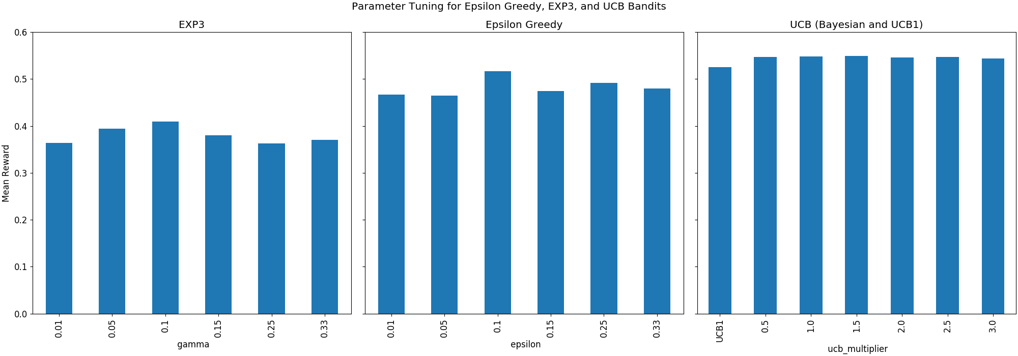
The above three plots show the mean reward for the three classes of algorithm across different hyperparameter values. The best gamma for EXP3 was 0.1, the best epsilon for Epsilon Greedy was 0.1, and the best UCB algorithm was a Bayesian UCB using a scale parameter of 1.5.
I used a large batch size of 10,000 recommendations per iteration of the algorithm while running the above hyperparameter search to speed things up, since a bandit runs fairly slow on a large dataset, let alone 19 of them like I used in this parameter search. For a final evaluation, now that we’re able to select the best possible version of each algorithm, I’ll reduce the batch size to just 100 recommendations per pass of the algorithm, giving each bandit more time to learn its explore-exploit policy.
Without further ado, here’s the cumulative and 200-movie trailing average reward generated by each of these parameter-tuned bandits over time:
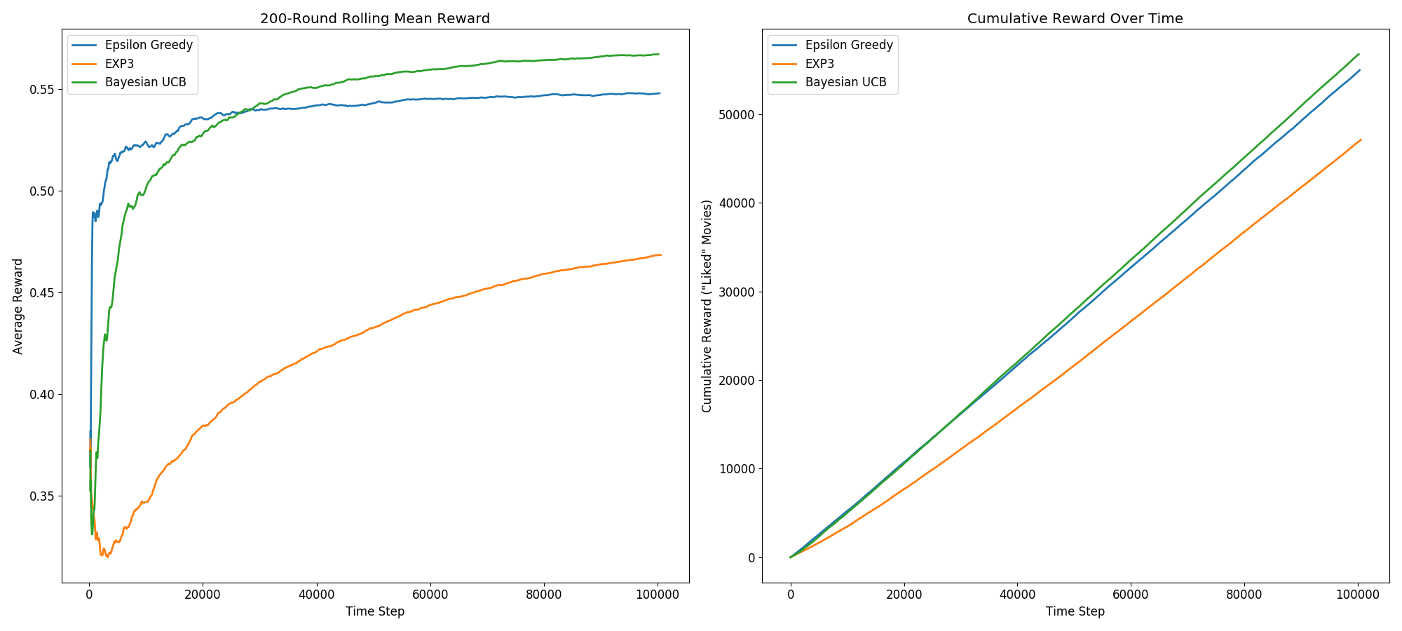
The first takeaway from this is that EXP3 significantly underperforms Epsilon Greedy and Bayesian UCB. This is fairly consistent with what I’ve seen on other people’s implementations.
More interestingly, we see the UCB bandit achieve a higher cumulative and average reward than the other two algorithms. It’s predictably a slower learner than Epsilon Greedy. All arms start with a large confidence interval since nothing is initially known about them, so it begins its simulation highly biased toward exploration over exploitation. Meanwhile, Epsilon Greedy spends most of its time exploiting, which gives it a faster initial climb toward its eventual peak performance. Due to its more principled and efficient approach to exploration, however, the UCB bandit ultimately learns the best policy, overtaking Epsilon Greedy after roughly 25,000 training iterations.
The final mean rewards yielded by these three approaches, after roughly 1,000,000 training iterations, were 0.567 for the Bayesian UCB algorithm, 0.548 for Epsilon Greedy, and 0.468 for EXP3. To give some additional context to this, random guessing in this task would yield an average reward of 0.309 (the mean “like” rate in this dataset), so all three algorithms have clearly achieved some degree of learning in this task.
Parting Thoughts
In this post I discussed and implemented four multi-armed bandit algorithms: Epsilon Greedy, EXP3, UCB1, and Bayesian UCB. Faced with a content-recommendation task (recommending movies using the Movielens-25m dataset), Epsilon Greedy and both UCB algorithms did particularly well, with the Bayesian UCB algorithm being the most performant of the group. This experiment shows that these algorithms can be viable choices for a production recommender system, all doing significantly better than random guessing and adapting their policies in intelligent ways as they obtain more information about their environments.
One important consideration that this experiment demonstrates is that picking a bandit algorithm isn’t a one-size-fits-all task. The suitability of any given algorithm for your task depends not only on your problem domain, but also on the size of your dataset. While the UCB algorithm was ultimately the most successful in this experiment, it took roughly 25,000 iterations of the algorithm for it to reach a point where it consistently outperformed Epsilon Greedy. This demonstrates that, depending on the volume of your data, you may want a faster-learning algorithm such as Epsilon Greedy, rather than a slower-learning, but ultimately more performant algorithm such as a Bayesian UCB.
A second thing to consider is that none of these algorithms take into account information about their environment or a user’s past behavior. A traditional recommender system may still outperform any of these bandits if you have other features at your disposal to make accurate predictions for a given user, as opposed to making global optimizations that apply uniformly to all users as is the case with these four bandit algorithms. There exists a compromise between these two approaches called Contextual Bandits, which apply a bandit-learning approach but use information about content and users to make more accurate recommendations. I may explore these in a future post to see how a contextual bandit fares compared to these four context-free bandits.
I would last like to thank Jeremy Kun, Lilian Weng, and Noel Welsh, whose resources I found very helpful in understanding the mathematics behind UCB1 and EXP3. I would recommend any of their above-linked resources for further reading on these topics.
Code for this post can be found on github.
Want to learn more about multi-armed bandit algorithms? I recommend reading Bandit Algorithms for Website Optimization by John Myles White.

 A Typical Infield Shift // mlb.com
 The LA Dodgers Getting Shifty // DENIS POROY / GETTY
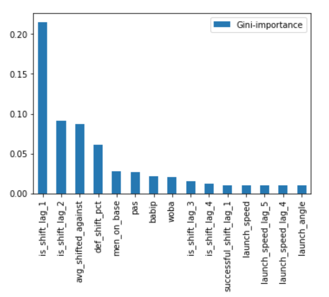 Ranked Feature Importances from Random Forest Model
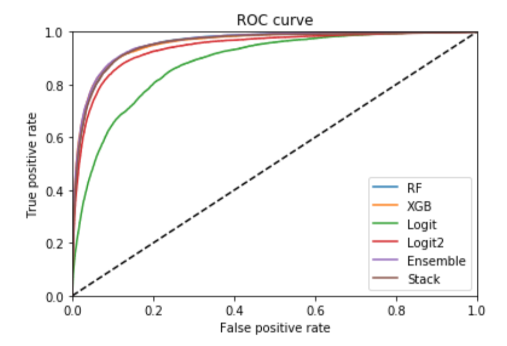 AUC Scores for All Models
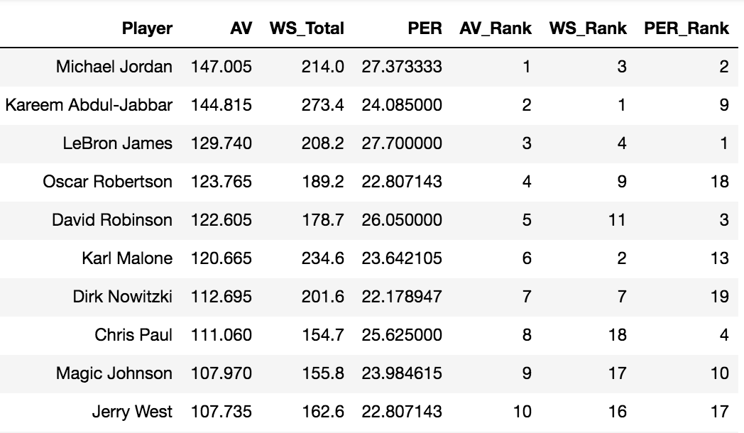 Table 1: Top Ten Players Drafted Since 1960 According to Approximate Value (AV)
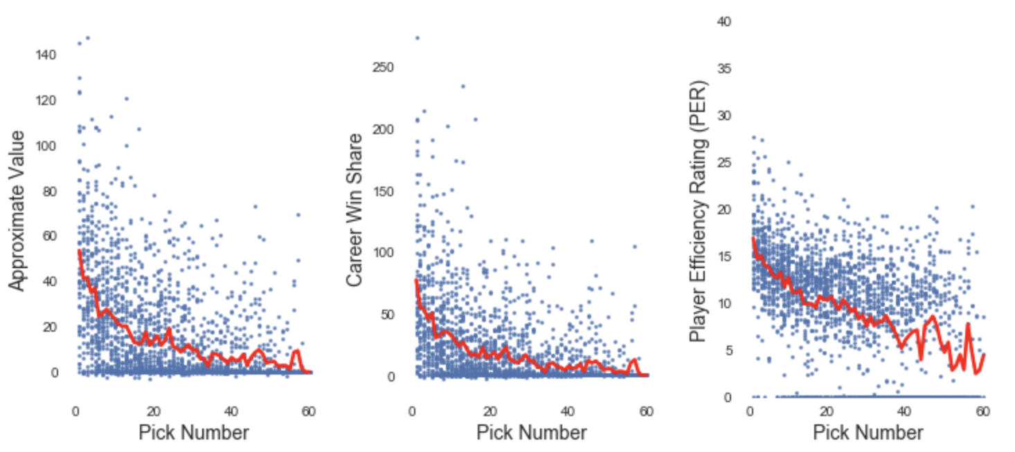 AV, WS, and PER by Pick Number, with Means Shown in Red
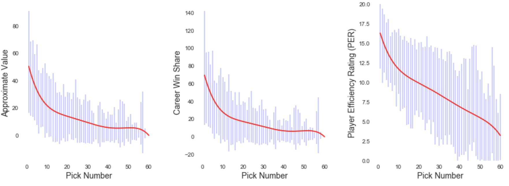 Smoothed Expected Values for Each Pick Number. Error Bar Represents One Standard Deviation in Either Direction.
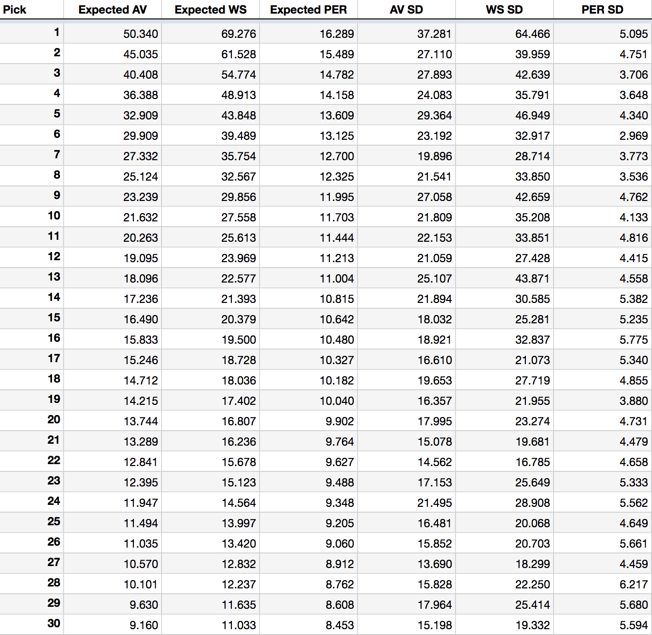
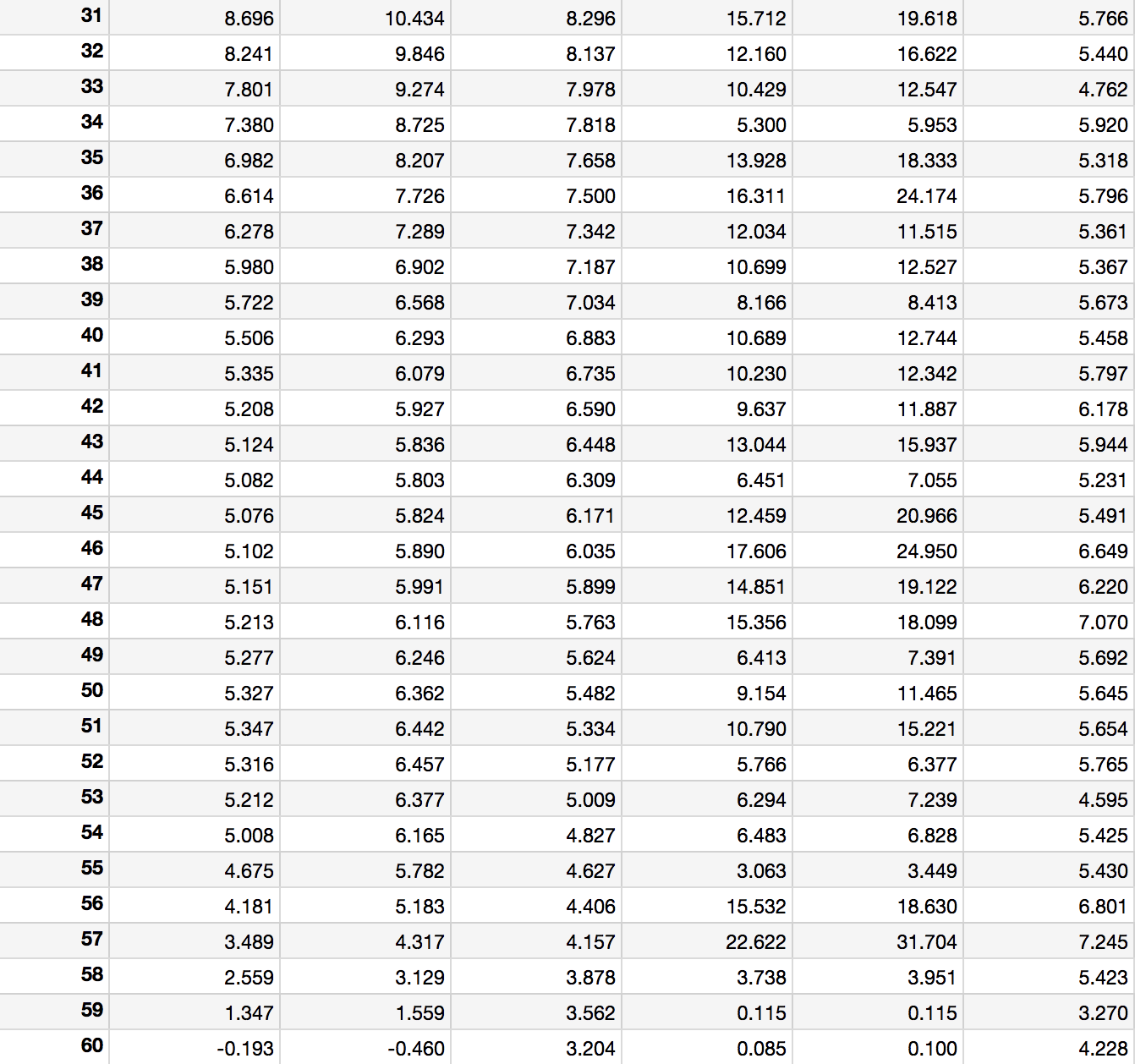 Table 2: Expected Values and Standard Deviations of Each Pick Position
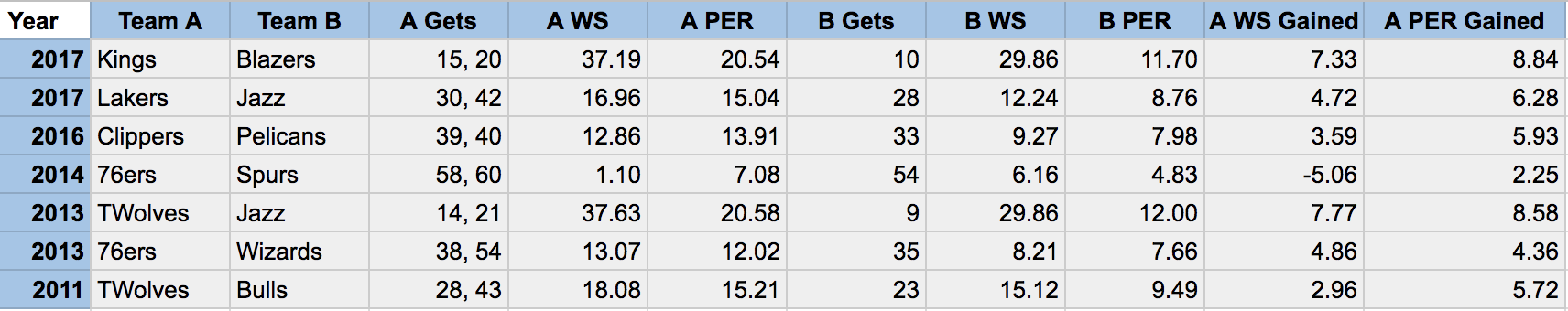 Table 3: WS and PER Gained/Lost in Recent Draft Day Trades Involving Only Draft Picks
 Table 4: Odds of Winning Each Pick by Inverse Record Ranking. Lottery Picks are Highlighted.
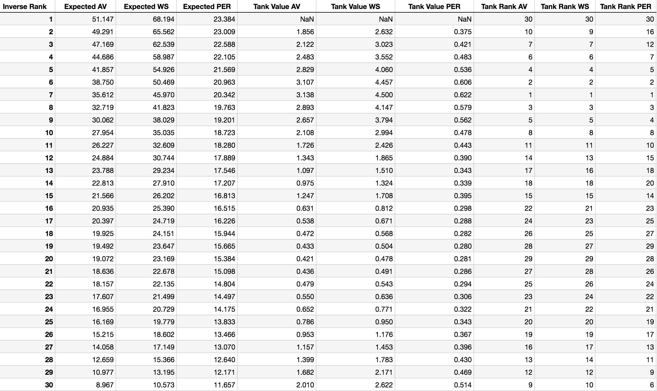 Table 5: Expected Value and Tanking Opportunity of Each Inverse Team Ranking
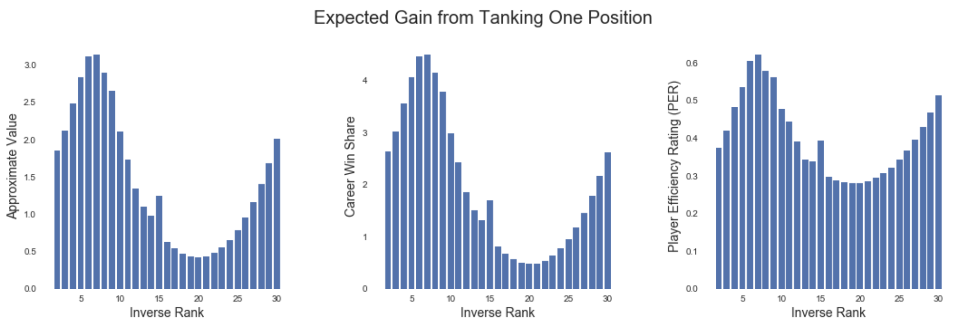 Draft-Pick Value of Falling One Position in the Rankings
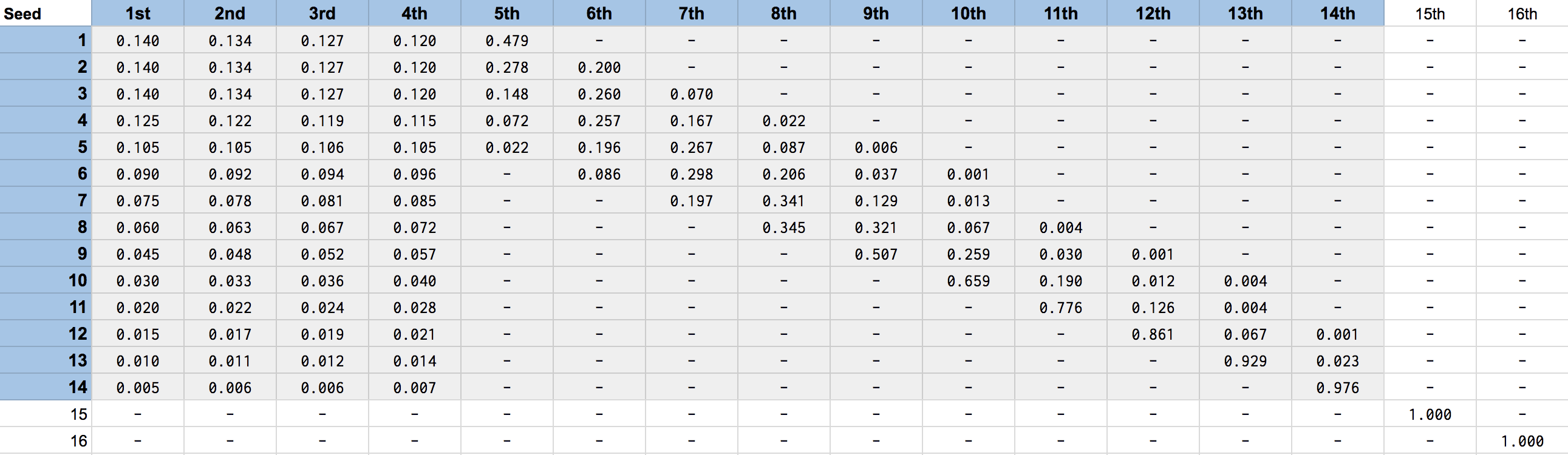 Table 6: Lottery Odds Effective 2019
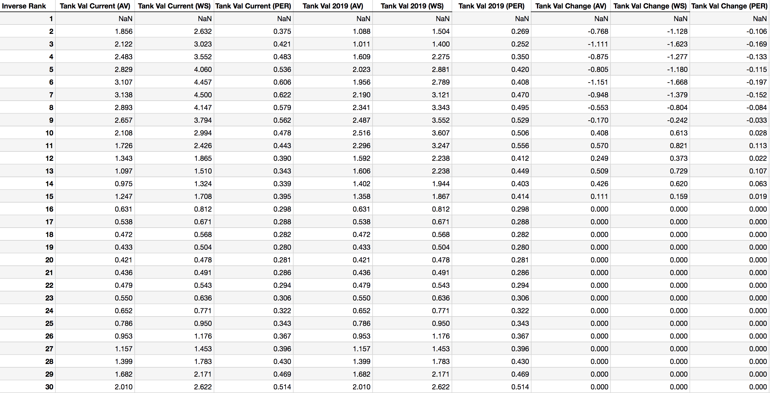 Table 7: Tanking Values under Current and Future Lottery Odds
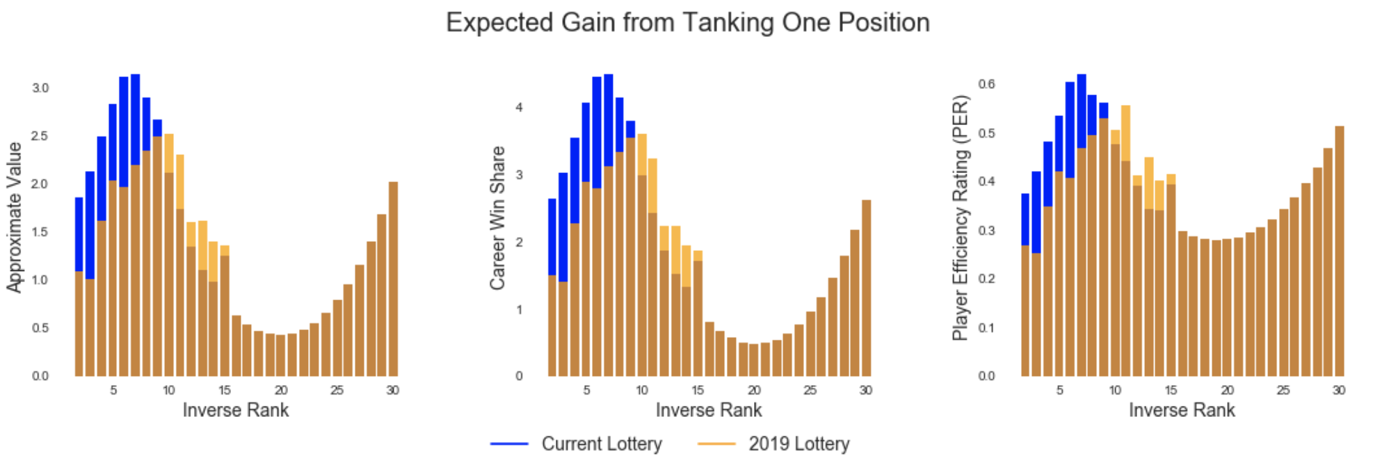 Tanking Values Before and After Rule Change

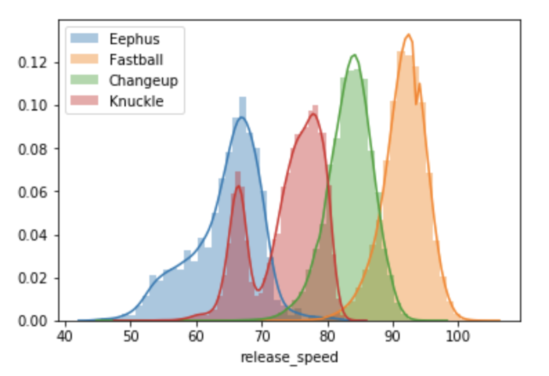
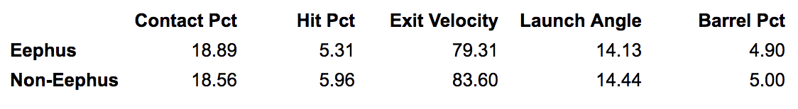
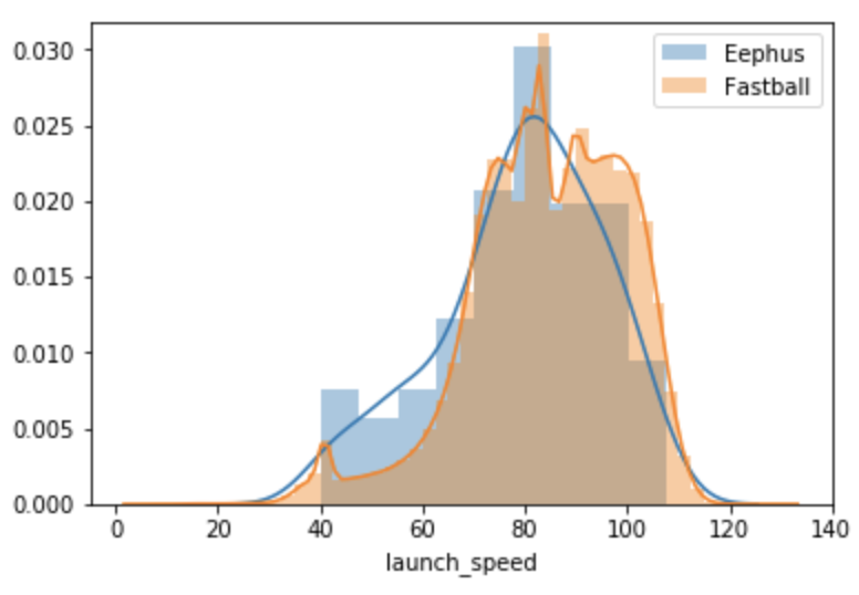
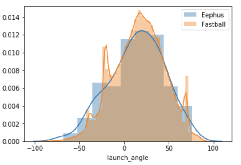
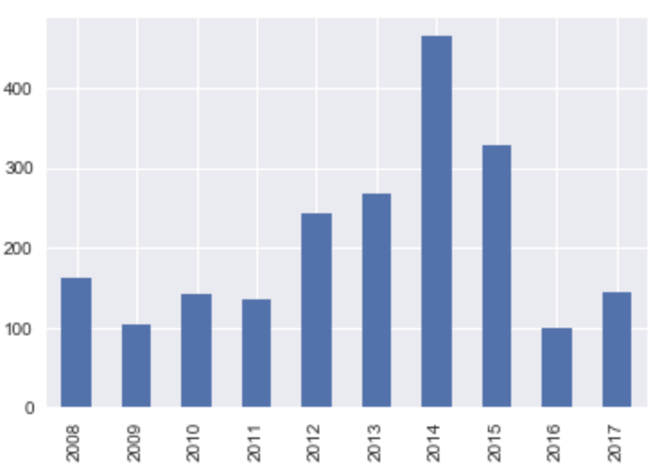 Eephuses thrown by season
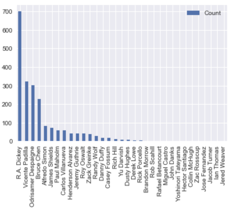 Eephus count by pitcher, 2008 - 2017